idfive.com
When I started at idfive, I was struck by how much the agency’s brand didn’t reflect its true story and capabilities. Instead, it was dated and inconsistent, with outdated documents still in use, no true, cohesive visual language, and a generally haphazard appearance.
Coming from a brand-focused agency, I was determined to improve it. After starting with competitive and comparative research to make a case for a complete update, by the end of my first six months, we had updated the logo, color palette, and typography.
When our internal marketing department requested an expanded palette, I asked for the opportunity to flesh out a fully realized brand. And I got it. By the end of my first year, we rolled out an overhaul that was embraced enthusiastically by the entire office. The unusual choice of purple, a custom plaid, modern typography, subtly toned black and white photography, and other unique visual elements work to differentiate us from our competition and maintain a cohesive brand across all of our communication channels. View the full brand guide (PDF).
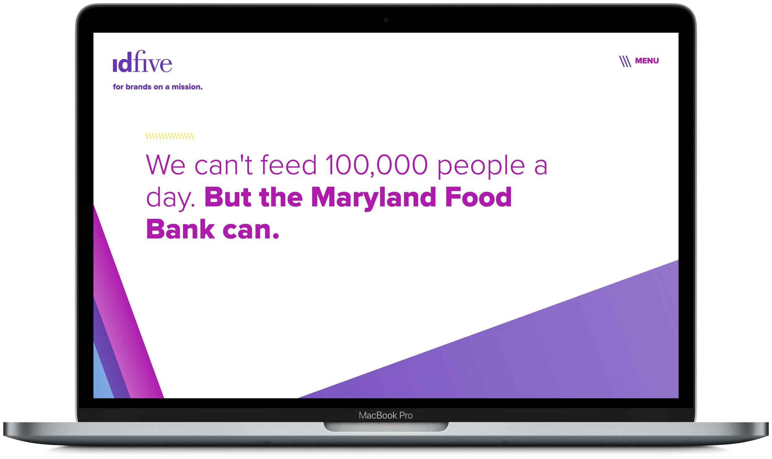
And, after nearly eighteen months of starting and stopping, more QC hours than I can count, and above-average levels of blood, sweat, and tears, we launched a brand new website. Built from the ground up to refocus on our why, our reason for existence, it showcases everything that makes idfive exceptional—our people, our work, our passion.
(Side note: I also shot almost all of the portraits on the team page, with the exception of some of our remote folks.)


